Broadsheets
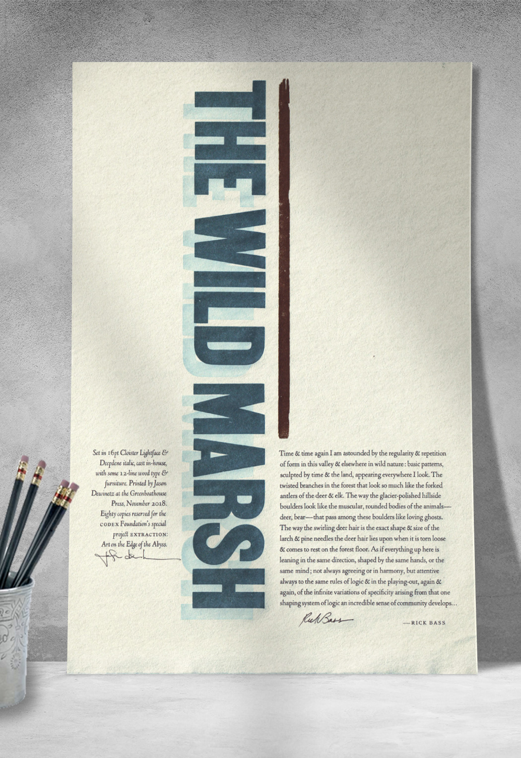
The Wild Marsh
December 2018 | Printed for Extraction: Art on the Edge of the Abyss.
¶ Early in 2018 Peter Koch reached out to ask if I'd be interested in taking part in his latest project, and although I was busy finishing up printing 49 Days, I couldn't very well turn him down. As Peter explained in the project overview:
Twenty-six poems and lyrical texts addressing the theme of extraction by leading American and Canadian writers have been selected and paired with an equivalent number of notable letterpress printers, each of whom have been invited to produce a broadside.
The project was published in 2019. All the details can be found here: WORDS on the Edge: Broadside Portfolio. In addition to 80 copies for Peter and another 20 for Rick Bass (the author), I also turned out enough extra prints for friends & subscribers.
Colophon:Set in 16pt Cloister Lightface & Deepdene italic, cast in-house, with some 12-line wood type & furniture. Printed by Jason Dewinetz at the Greenboathouse Pres, November 2018. Eighty copies reserved for the Codex Foundation's special project Extraction: Art on the Edge of the Abyss.
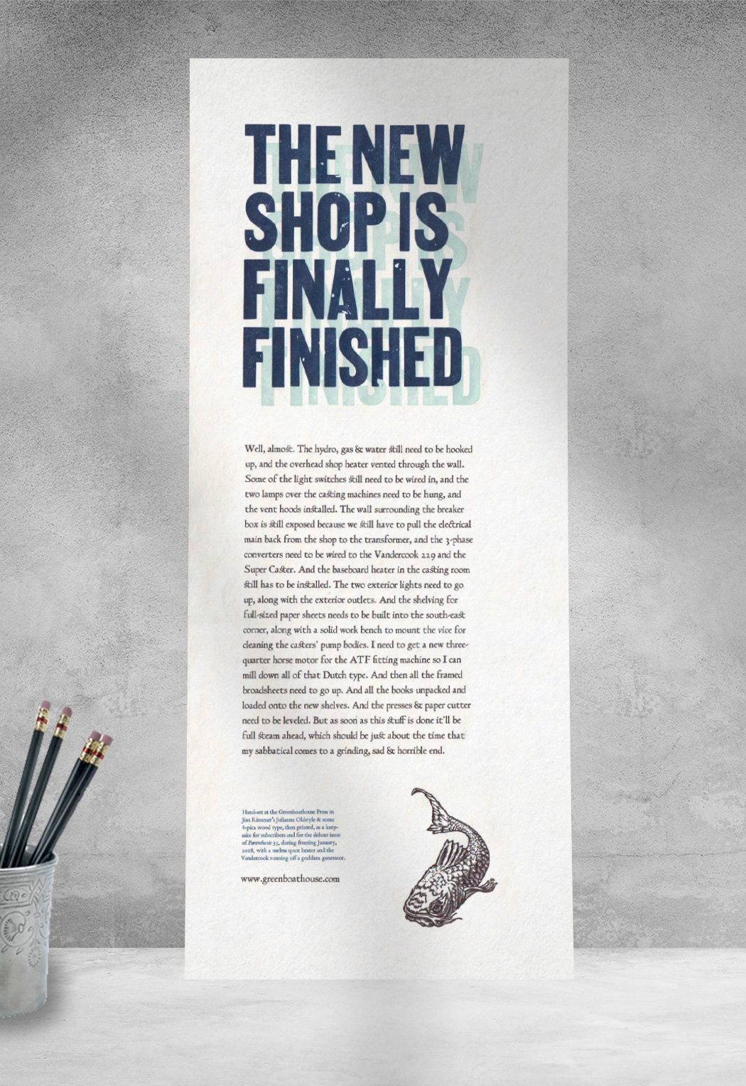
New Shop, Almost
January 2018 | Printed for Parenthesis 35 and as a keepsake for friends & subscribers of the press.
¶ With the new shop almost finished at the end of 2017 I was going a bit crazy after nearly a year without a press, so despite the cold (and no heat yet in the shop) I hunkered down and set the type for this rather ridiculous bit of work. Set in Jim Rimmer's rough and ragged Julianna Oldstyle, the type was cast by Alex Widen, who did a very nice job of it. The handmade paper used for the project was pretty dangerous, as it had a lot of clots in it, so the wood type really took a beating, and the titling text pretty much changed from one copy to the next as it was hammered and dented with each pass.
Colophon: Hand-set at the Greenboathouse Press in Jim Rimmer's Julianna Oldstyle & some 8-pica wood type, then printed, as a keepsake for subscribers and for the deluxe issue of Parenthesis 35, during freezing January, 2018, with a useless space heater and the Vandercook running off a goddam generator.
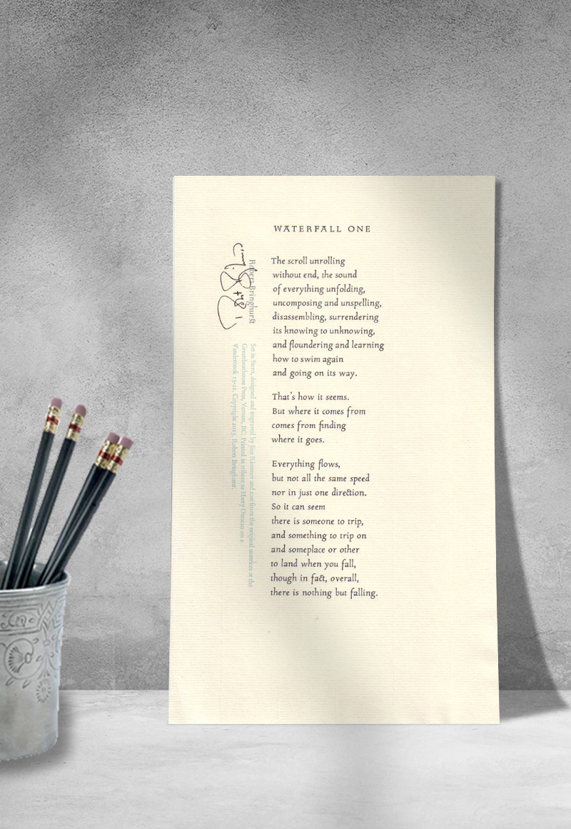
“Waterfall One”
Robert Bringhurst
July 2015 | Printed in a number of sizes on off-cuts.
¶ Greenboathouse Press was invited to produce a broadsheet in honour of the late Harry Duncan, to be included in a fund-raising portfolio and also to be displayed at an exhibit of Duncan's work (and work by Duncan's many students and admirers) at the Uno Art Gallery in Omaha, NE.
Printed specifically for the Harry Duncan project and our subscribers.
Hand set in 16pt Stern, designed by Jim Rimmer, and printed into a variety of off-cuts.
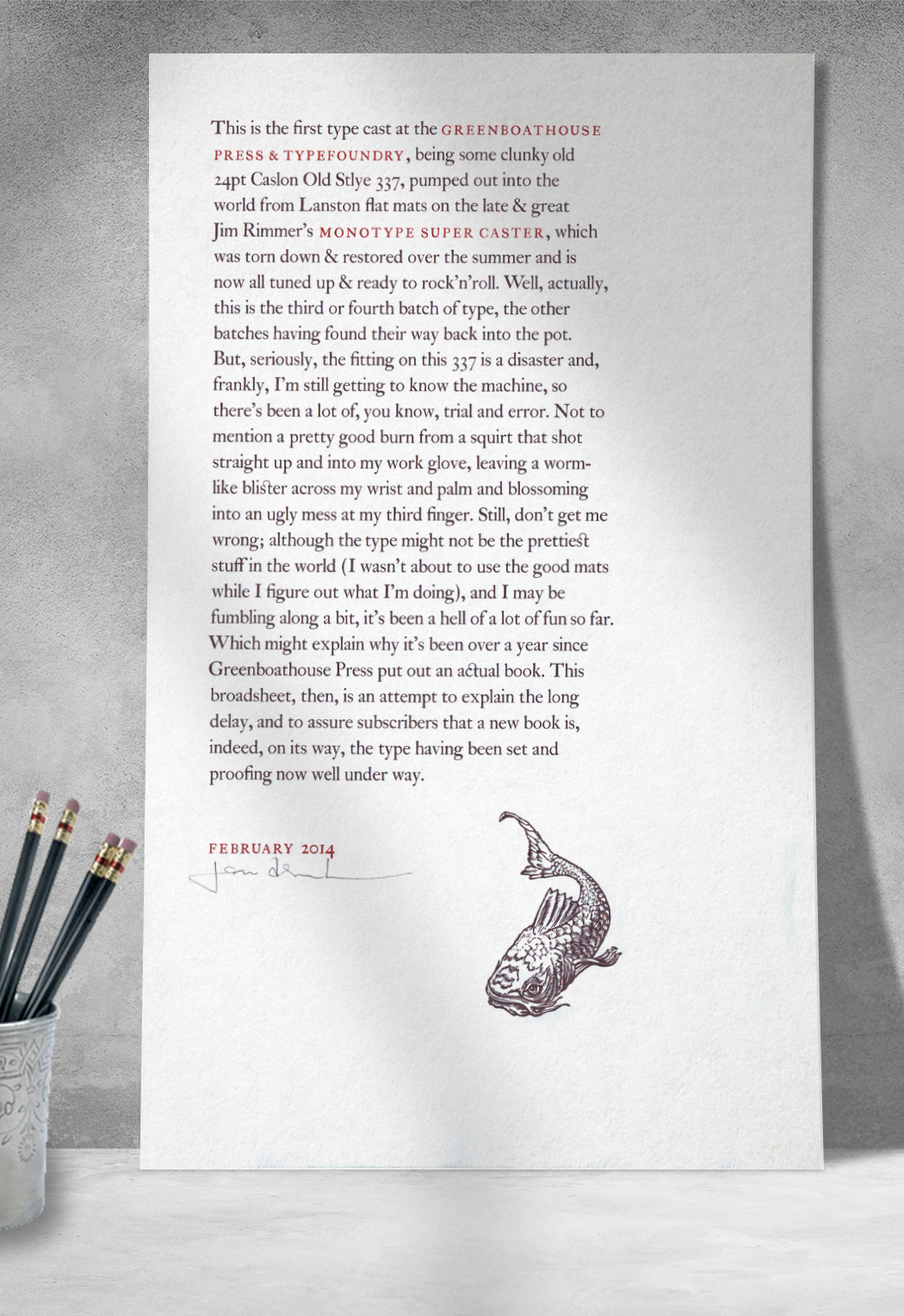
First Casting
February 2014 | Printed for friends & subscribers.
¶ After bringing home Jim Rimmer's casting equipment in 2010, which sadly sat in storage for a few years until I had a space to set it all up, at last I was able to fumble my way through a lengthy learning curve until, in February of 2014, I managed to crank out my first cases of type. Not wanting to risk damage to any matrices for types I was eager to put to use as house fonts, I decided to cast up a bunch of 24pt Caslon 337. Along the way, grumbling through 337's notoriously poor fitting, I also managed to get my first really good casting burn (molten typemetal simmers at just under 700 degrees). This broadsheet documented this early effort which, despite the scars, turned out some very nice type.
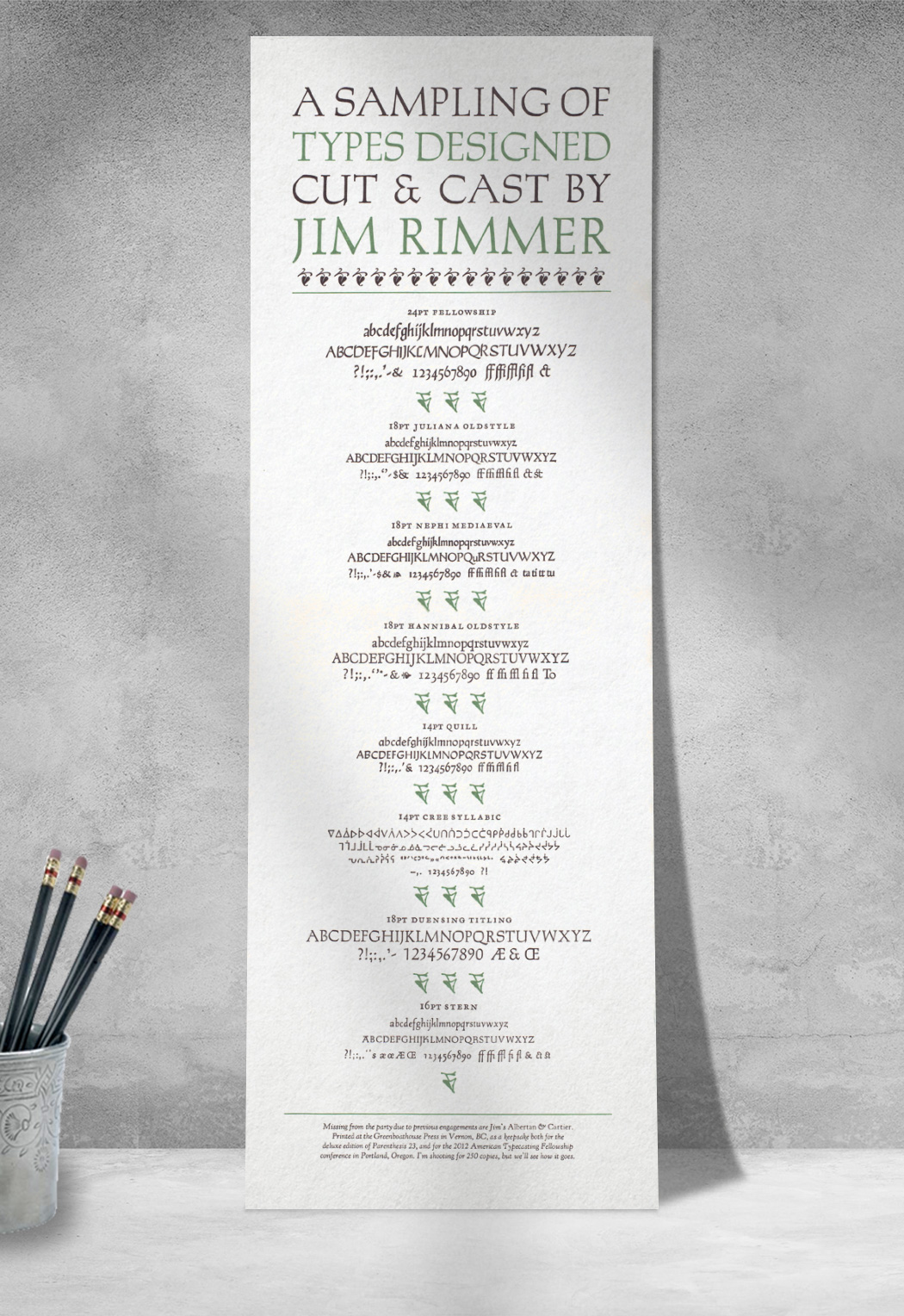
Jim Rimmer Specimen
May 2012 | Printed for Parenthesis 23 and as a keepsake for the 2012 American Typecasting Fellowship conference in Portland, OR.
¶ 2012 marked my second trip to the ATF conference (I've since also made it to the 2014 and 2016 events). The 2012 gathering was hosted by the folks at the C.C.Stern Typefoundry, named after Chris Stern, who is also the namesake of Jim Rimmer's final metal typeface, Stern. At each event participants are invited to produce a keepsake, and at the end of the conference we all gather around a big table and make the trip around to gather up copies of all the goodies. For the bundle I decided to pull out all of the Rimmer types I had in the shop and do up a specimen to distribute. Jim is somewhat of a legend to many of the ATF folks, given what he managed to accomplish tucked away in his rather cramped New Westminster basement, so I figured a showing of his efforts would be appreciated, which it certainly was.
¶ Since I was at it, I also printed up an extra 125 copies for the deluxe issue of Parenthesis 23.
Colophon: Missing from the party due to previous engagements are Jim's Albertan and Cartier. Printed at the Greenboathouse Press in Vernon, BC, as a keepsake for the deluxe edition of Parenthesis 23, and for the 2012 American Typecasting Fellowship conference in Portland, Oregon. I'm shooting for 250 copies, but we'll see how it goes.
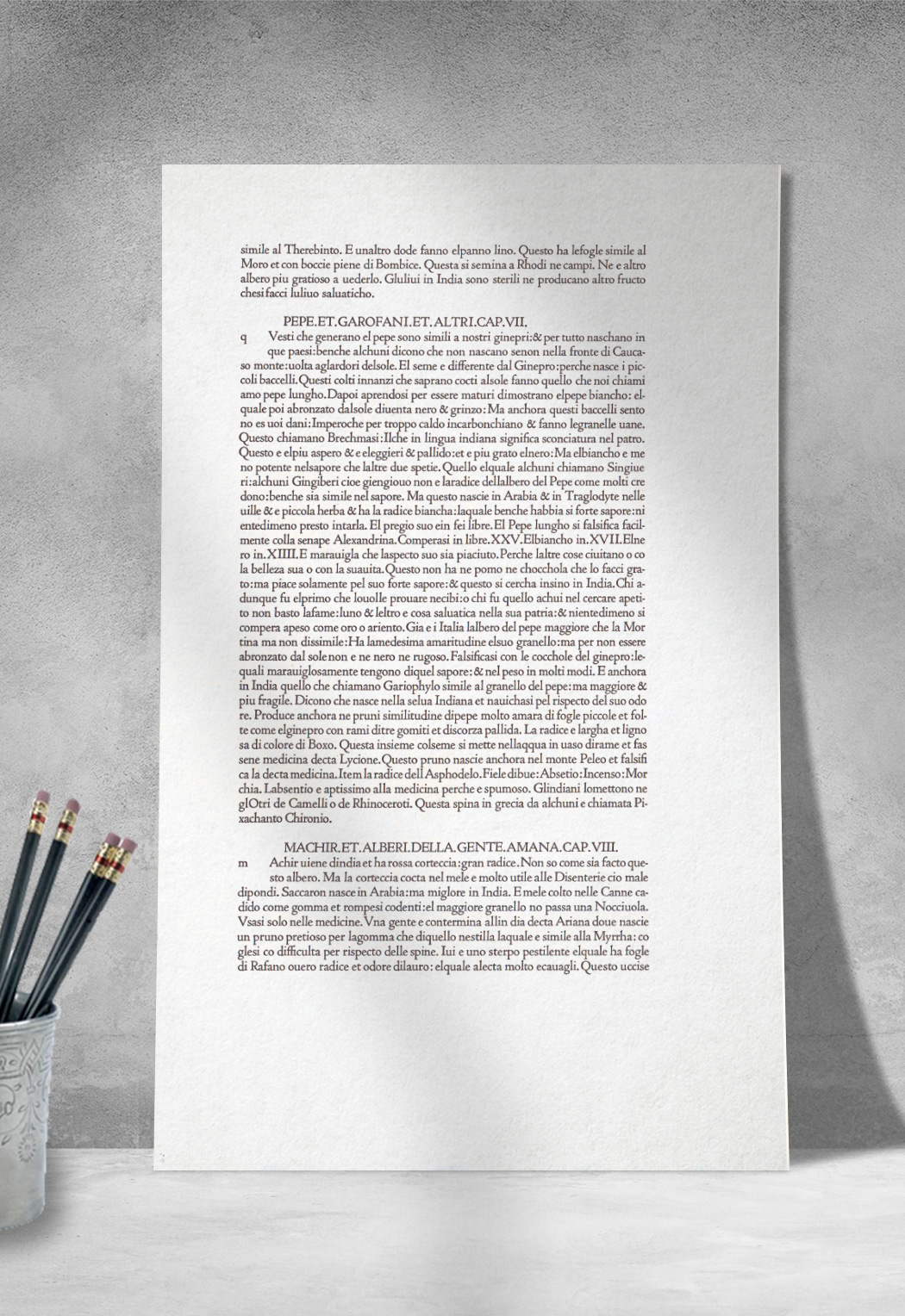
Jenson Reproduction
Spring 2010 | Printed for Canadian Notes & Queries Magazine.
¶ Text reproduced from folio 150 of Plinius Secundus, Gaius. Historia Naturale di. C. Plinio Secondo Tradocta di Lingtta Latina in Fiorentina per Christophoro Landino Fiorentino al Serenissmo Ferdinando Re di Napoli. (Phew.) Venice: Nicolaus Jenson, 1476.
¶ One of Nicolas Jenson's early editions, set in his first and most famous roman type, with about fifty lines of text to a page. Pliny was a prolific writer on history and rhretoric, but only his encyclopedic Historia naturalis has been preserved. This specimen was set by hand in a revival of Jenson's famous type: Cloister Old Style, designed by Morris Fuller Benton in 1913 for the American Type Founders (ATF). Certain characters are not included with the Cloister (archaic long-s, long-tailed Q), and so were replaced with the standard sorts.
Published as a keepsake for Canadian Notes & Queries (CNQ) in an edition of 350 copies, with an additional 65 copies produced for friends and subscribers of the press. Printed on a Vandercook 15-21 into Magnani Velata Avorio, early spring 2010.
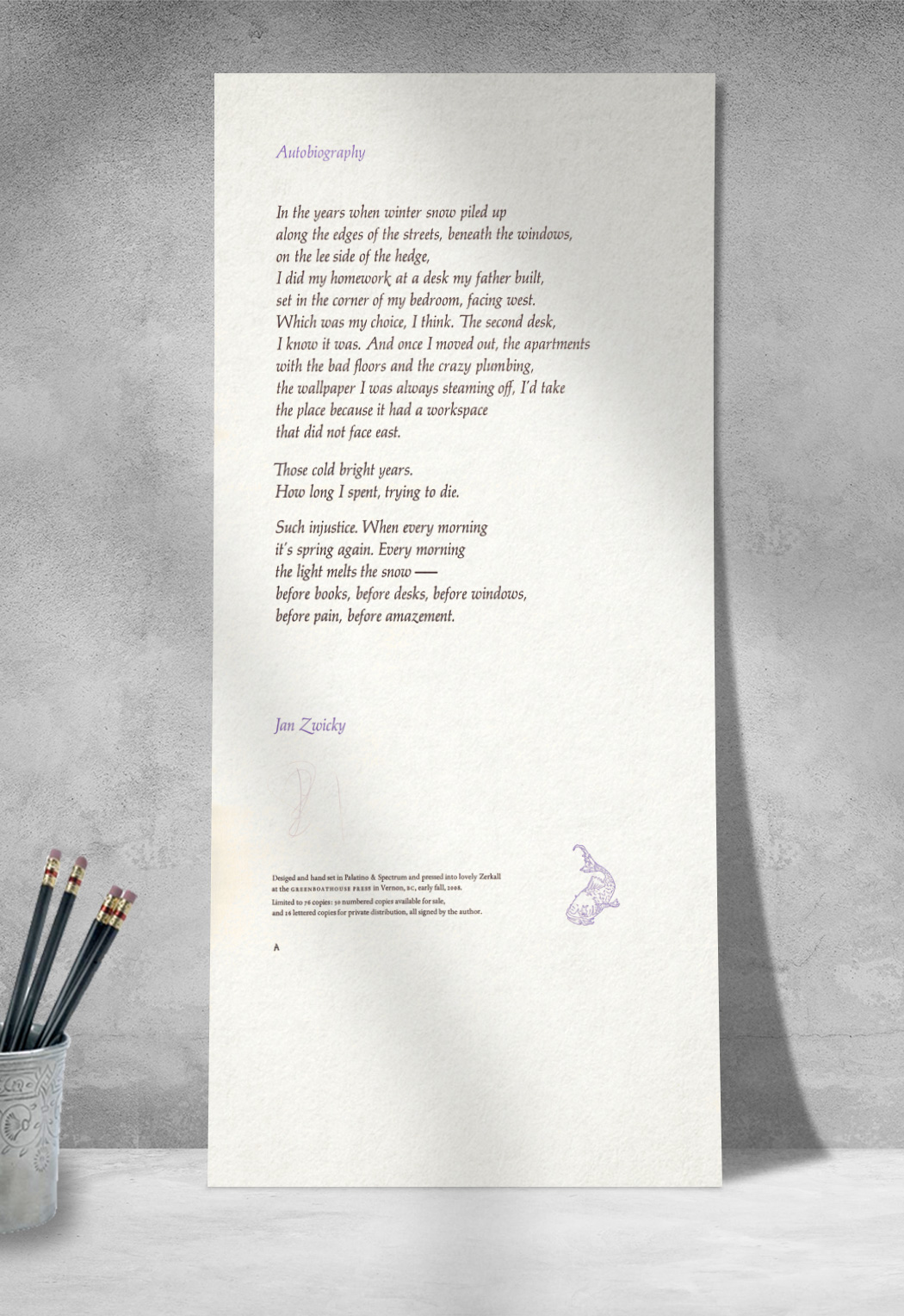
“Autobiography”
Jan Zwicky
September-October 2008 | 10" × 21" | $25
Copies available, .
¶ An admirer of Jan's writing for years, it was a pleasure to have her submit a piece to be worked up as a broadsheet. From the start I knew I wanted to put the 24pt Palatino Italic to work with this poem, after hauling it all the way from Brooklyn, NY, earlier in the year. Like Bringhurst's sheet (below), Jan's was hand-set and printed into Zerkall mould-made paper, with the title, byline and early press device printed in a mixed mauve. Both of these broadsheets were a pleasure to set and print, and an honour to produce and put out into the world.
Hand set in 24pt Palatino Italic and printed in mauve & black into Zerkall Book Wove; including an early rendition of the press device, drawn by kevin mcpherson eckhoff and printed from polymer.
50 numbered copies for sale (26 reserved for early subscribers), and 26 lettered for private distribution, all signed by the author.
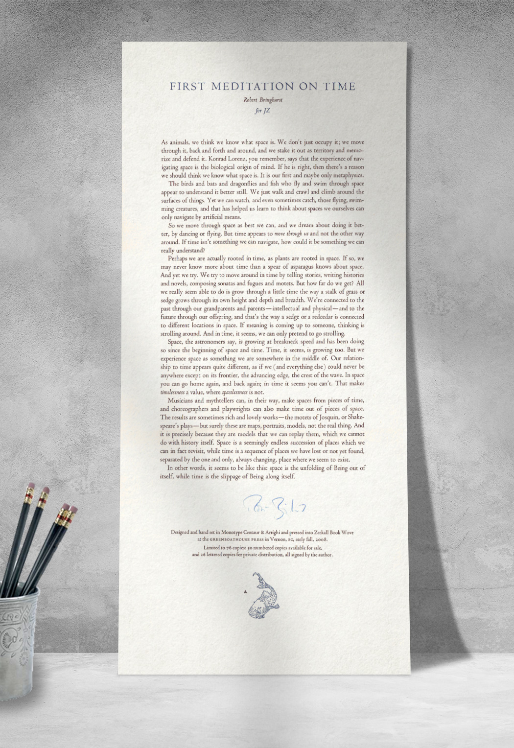
“First Meditation on Time”
Robert Bringhurst
September-October 2008 | 10" × 21"
¶ With the opportunity to publish a piece by Bringhurst, I decided to up the difficulty level a bit and select the longer, prose work that Robert was kind enough to send in. The task, of course, was not only to fully justify the lines in metal, but to do a decent enough job of it that presenting the broadsheets for signatures wouldn't be entirely painful. The sheet was printed on 10" × 21" Zerkall mould made paper, with the early press device (drawn by kevin mcpherson eckhoff) printed from polymer, and the poem itself hand-set in Monotype Centaur. The title, dedication and press device were printed in a deep navy blue.
¶ Upon completion of this, and Jan Zwicky's sheet (above), it was off to Quadra Island to spend a night at Robert's to have he & Jan sign all of them. A fantastic meal, good conversation, and an absolutely lovely atmosphere in the woods of the island were a wonderful way to complete this early project.
Hand set in 18pt Centaur and printed in mixed rich blue & black into Zerkall Book wove; including an early rendition of the press device, drawn by kevin mcpherson eckhoff and printed from polymer.
50 numbered copies for sale (26 reserved for early subscribers), and 26 lettered for private distribution, all signed by the author.
The Stern Broadsheets
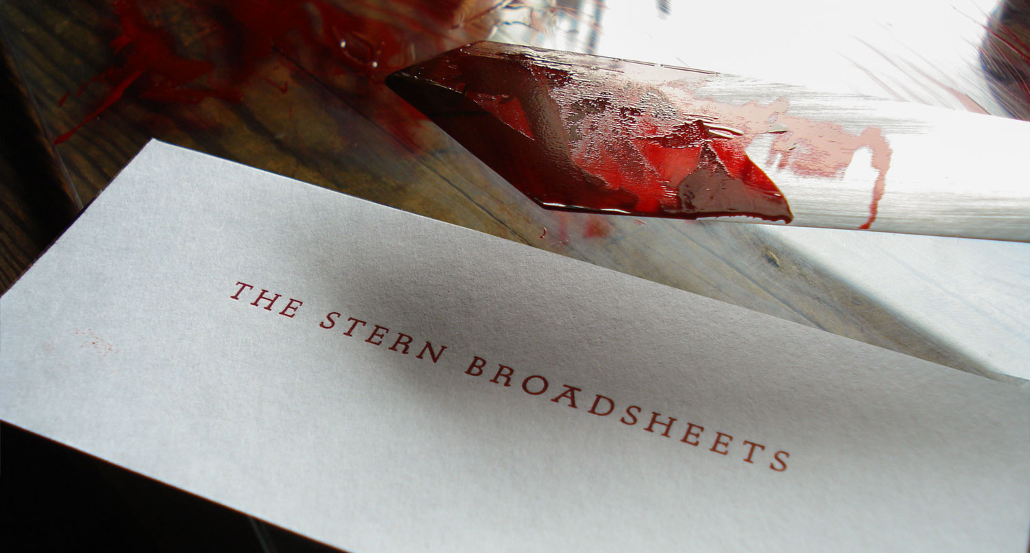
¶ During the summers of 2008 and 2009, as momentum was just getting started with the new Vandercook, I had the idea to gather a number of poems by male writers pulling at the threads of the notion(s) of masculinity. I'd hoped to gather 10 such pieces by Canadian authors, but after printing the four shown below the series ended up shelved as I pushed into book-length projects. One day I'd like to take it up again, but for the time being these four are what saw the light of day.
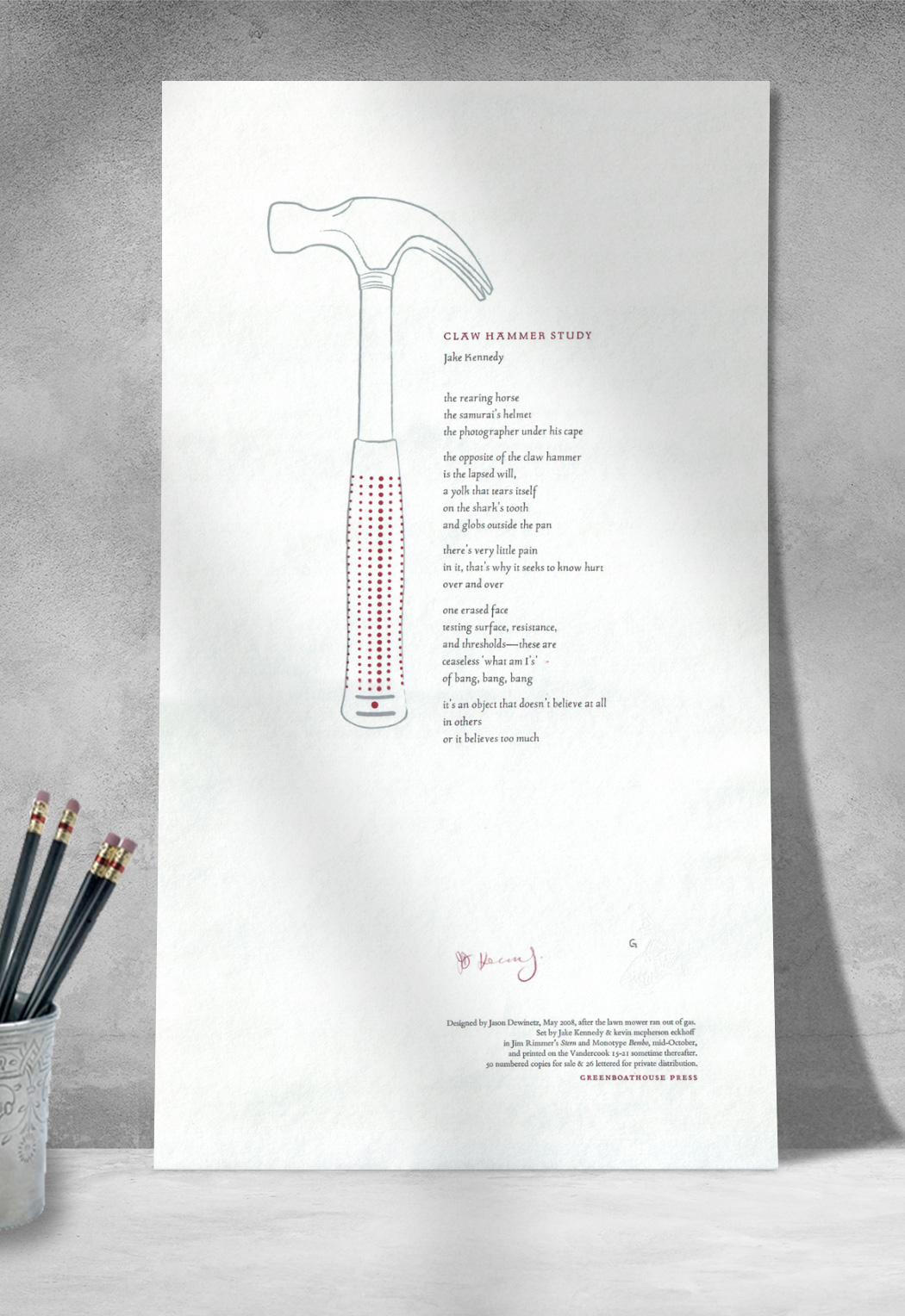
“Claw Hammer Study”
Jake Kennedy
October-November 2008 | 10" × 18" | $15
Copies available, .
¶ After working with Jake at Okanagan College for over a year by 2007, I'd still not gotten around to reading his BookThug chapbook Hazard, despite the fact that it had won the bpNichol award a few years earlier. That summer the two of us ended up doing a reading together at UBCO in Kelowna, and he read a handful of poems, "Claw Hammer Study" included. I was knocked over. Hammered. And so I went home and read Hazard a half-dozen times. Then I emailed Jake and insisted on producing this poem as a broadsheet (Greenboathouse Press has since published two of Jake's books, Light & Char and Kobayashi, the Will).
Hand set in 16pt Stern and printed in red, grey & black.
50 numbered copies for sale (26 reserved for early subscribers), and 26 lettered for private distribution. All signed by the author.
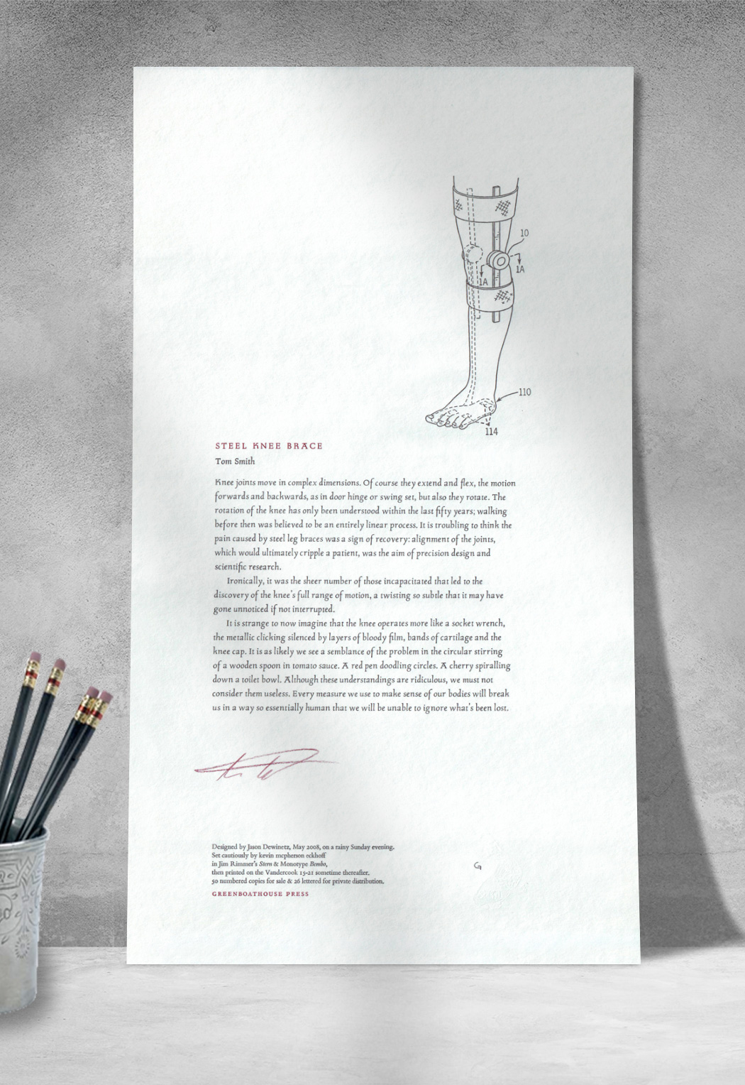
“Steel Knee Brace”
Tom Smith
October-November 2008 | 10" × 18" | $15
Copies available, .
¶ Tom Smith was a creative writing student of mine in 2007/8, and when this poem came in I was very impressed indeed. Not that Tom's other stuff wasn't solid, but this poem went far beyond the assignment I'd given him (to write about something specific without really writing about it).
Hand set in 16pt Stern and printed in red & black.
50 numbered copies for sale (26 reserved for early subscribers), and 26 lettered for private distribution. All signed by the author.
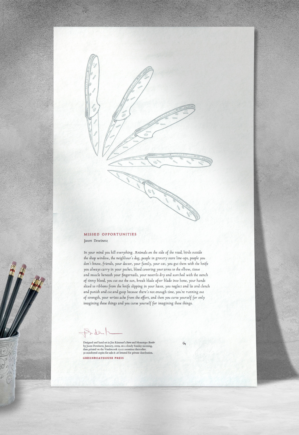
“Missed Opportunities”
Jason Dewinetz
May 2009 | 10" × 18" | $15
Copies available, .
¶ While I'd thought I'd sworn off publishing my own writing, this poem, from a small manuscript called Clench (published by Gaspereau Press in 2011), fit nicely with the Stern project.
Hand set in 16pt Stern and printed in red, grey & black.
50 numbered copies for sale (26 reserved for early subscribers), and 26 lettered for private distribution. All signed by the author.
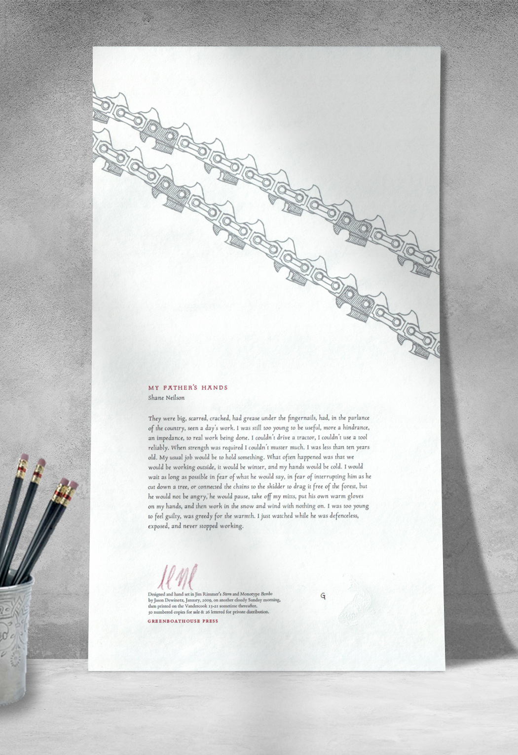
“My Father's Hands”
Shane Neilson
May 2009 | 10" × 18" | $15
Copies available, .
¶ Continuing the Stern series, I'd been wanting to produce something from Shane since his stunning collection The Beaten Down Elegies came out from Frog Hollow Press in 2003. A delicate piece exploring the author's young relationship to his father, the poem beautifully explores the ongoing theme of masculinity central to the Stern project.
Hand set in 16pt Stern and printed in red, grey & black.
50 numbered copies for sale (26 reserved for early subscribers), and 26 lettered for private distribution. All signed by the author.
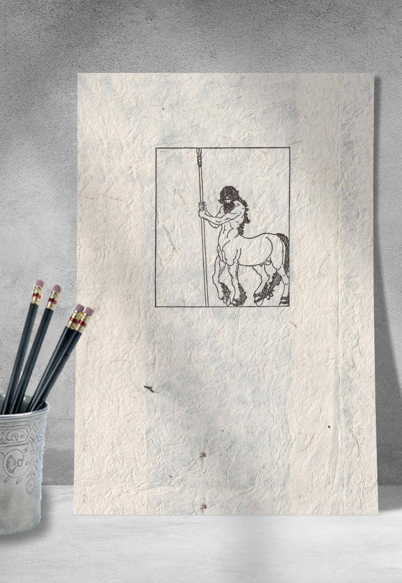
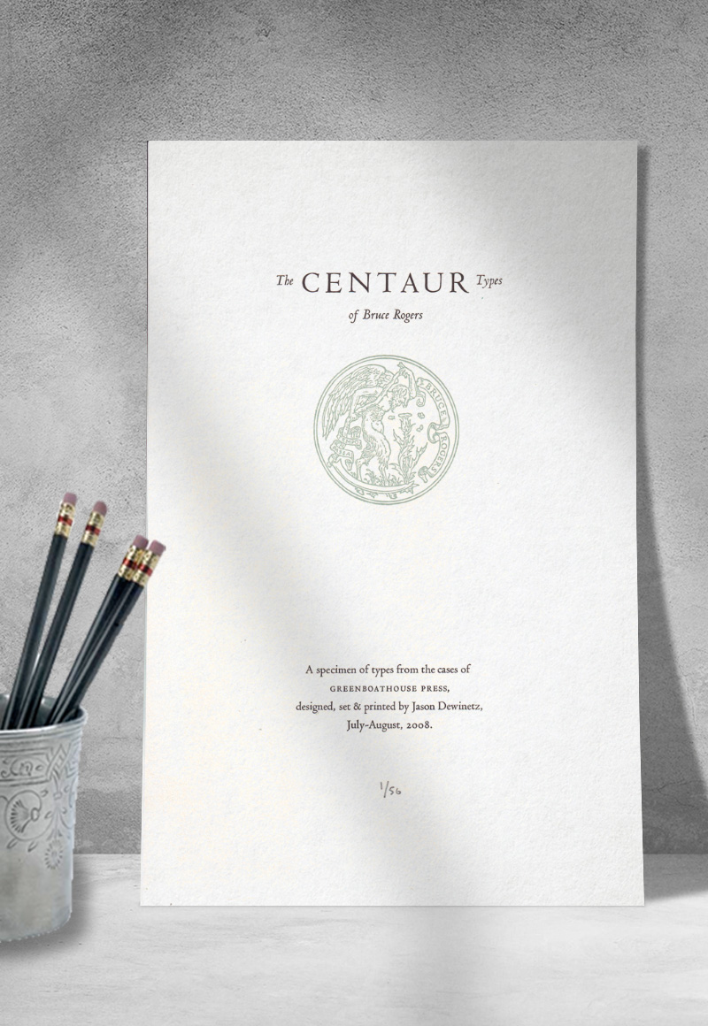
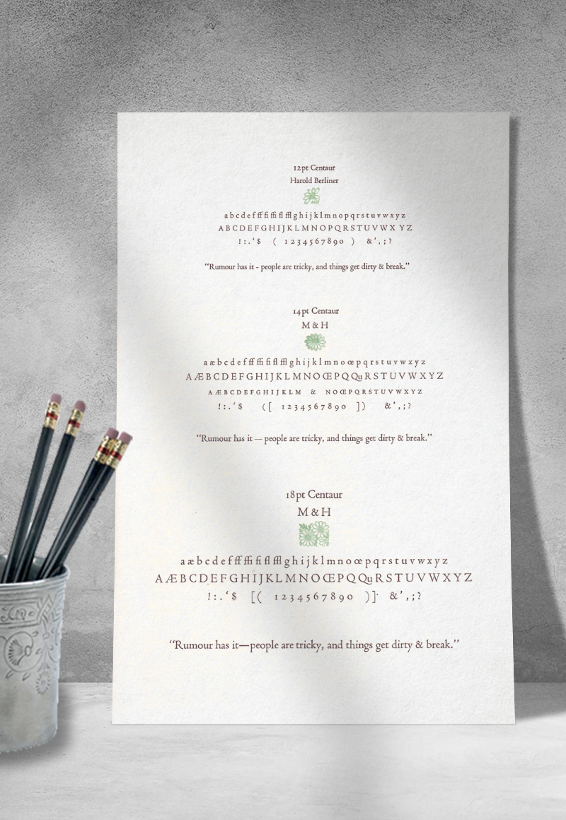
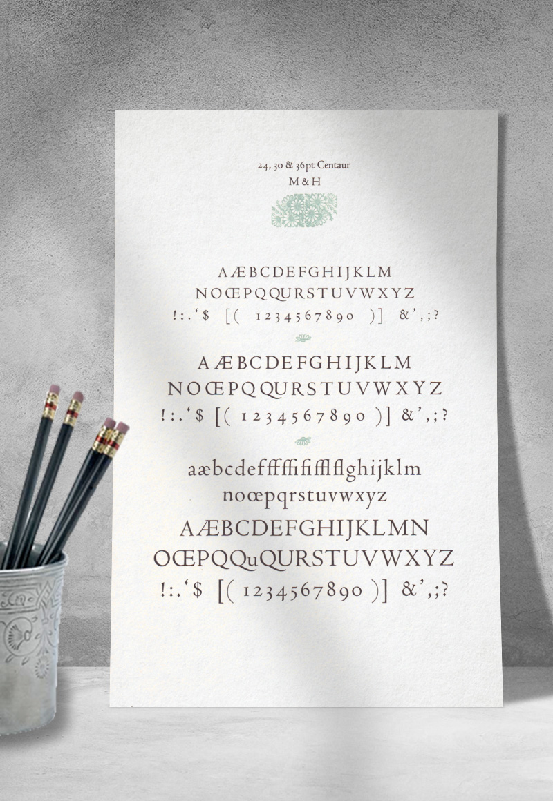
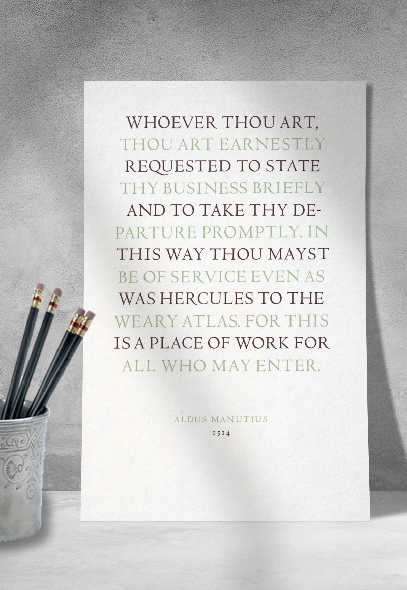
The Centaur Types of Bruce Rogers
July-August 2008 | 7.75" × 12.5"
¶ Originally planned to be a portfolio of specimens including all of the types held in the shop, I realized quickly that this was complete folly. Instead, I focused in on Bruce Rogers' Centaur types as a distinct project. In addition to specimens of the various sizes I had in cases, I also set a wonderful quote from Aldus Manutius (which was to reappear in 2017 in Lead, Tin & Antimony).
¶ In my eagerness to produce this project, I set and printed what I had listed as "Centaur Italic"; of course, there is no such thing — Centaur is traditionally paired with the Arrighi italic, designed by Frederic Warde. I was well aware of this, but somehow I got ink-blind and didn't see what I was doing. So, the entire thing had to be re-printed without the italic, otherwise the titlepage simply didn't make any sense.
¶ I came across the centaur illustration in the 1921 edition of The Golden Fleece and the Heroes Who Lived Before Achilles, and knew immediately that I wanted to include it in the project in some way (the original illustration included two other figures in the frame, which I removed to focus on the centaur). The illustration was taken into Illustrator and traced and cleaned up, then shipped out to Boxcar to have a polymer plate made. Rogers' printer's mark was reproduced using the same method.
“Matters of Concern”
June 2008 | 6" × 24"
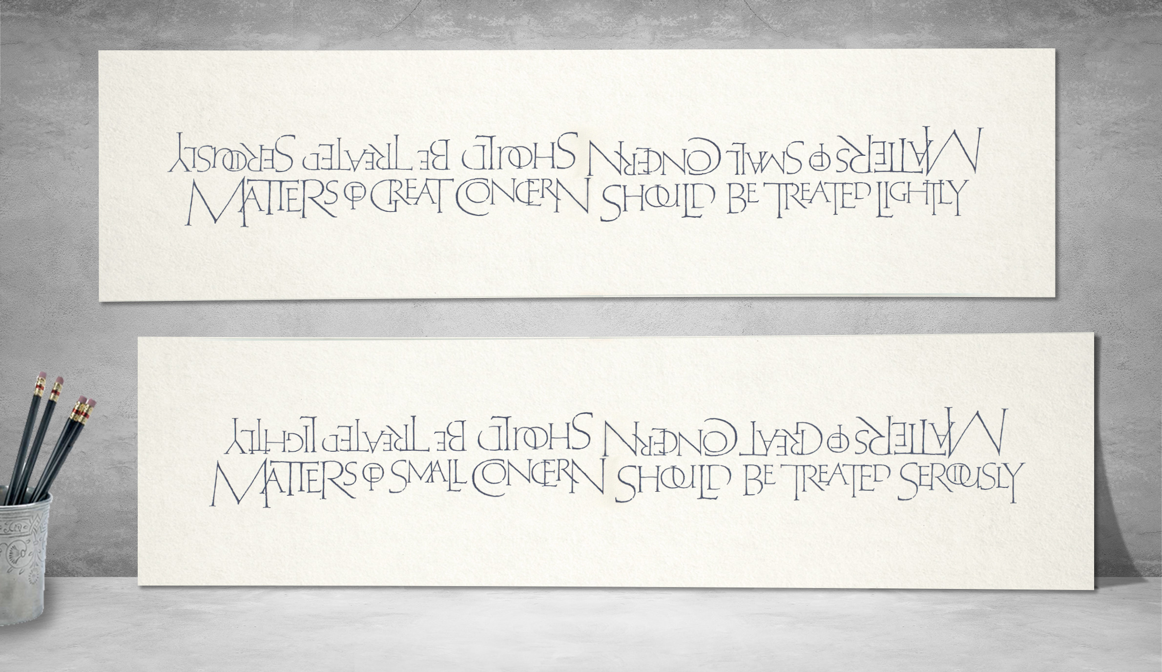
¶ This broadsheet involved over 5 years of planning & preparation. Years ago I came across an article on Friedrich Poppl in Baseline magazine, which included reproductions of some of his hand lettering, and on first sight I was knocked over by the simple beauty of his calligraphy. For months I kept going back to that magazine again and again to stare at Poppl's letters, and eventually I decided I wanted to create something based on his work.
¶ Over the course of a few months I sketched, comped, and digitized the available letterforms, cleaned up and tuned the outlines, then created a variety of glyphs that were missing from the samples, including a number of ligatures and contextual alternates. From there I brought the outlines into a font development application and created a working font from the drawings, including auto-substitutions (in the form of an OpenType font) such as TH, TT, SS, LO, LL, etc. With the font, I set a number of quotations that I've packed around in notebooks, but eventually settled on this passage from Hagikure: The Book of the Samurai, which had always struck me as a fine sentiment, both relating to typography & printing, but also to life generally (this quotation also appears in Lead, Tin & Antimony). From that point, the design sat idle for over 2 years while I waited to set up shop with a press, knowing that it was one of the first projects I wanted to produce once everything was up and running.
¶ As the colophon (below) indicates, the quotation was printed from photopolymer plates, while the colophon itself was hand-set in 12pt Spectrum. The paper was some end-cuts that came with the press (from Caryl), and after printing the colophon on June 22, I spent the day of the 25th printing all of the blue, which meant 3 runs through the press with each sheet (the quotation was printed from 2 plates, and then there was the Greenboathouse Press logotype on the back).
Colophon: The lettering is reconstructed from the work of calligrapher and | type designer Friedrich Poppl (1923-84), digitized and redrawn | by Jason Dewinetz between 2006 & 2007, and printed by | photopolymer plate on the Vandercook 15-21 & SP-15 flatbed | cylinder presses, recently moved in & set up in their newly | constructed studio home here under the blue sky | and blazing sun of Vernon, BC.
The type you are now reading is 12pt Spectrum, designed by | Jan van Krimpen, hand-set & printed, anxiously and with | much pleasure, by Jason Dewinetz. The excerpted passage is borrowed from Chapter 1 of | Hagikure: The Book of the Samurai.
This project marks the first stage of development of | Greenboathouse Press, to be followed by a series of type specimens | of house fonts, and then a gathering of broadsheets by | contemporary Canadian poets, to be distributed randomly to | friends of the press, and then bundled as a portfolio | available to subscribers. This sheet produced in an edition of 101 copies, each of which | has been signed, none too humbly, by the designer.