Printing Ondaatje
A version of the text below first appeared in
Book Arts/Arts du Livre Canada, Vol. 3, Number 2, 2012.
¶ In the grand scheme of things (even just the grand scheme of things printed), the Greenboathouse Press edition of Michael Ondaatje's long poem Tin Roof is, I suppose, a minor project. Consider Gutenberg's bible, the Kelmscott Chaucer or the doomed first English edition of Typefoundries in the Netherlands. Even on humbler and more recent scales, there is Peter Koch's book-slash-pilgrimage to Italy to print Watermark, or Jim Rimmer's single-handed creation of Tom Sawyer. When set beside projects of this scope, the making of Tin Roof appears quite simple. It has been, however, the most involved and challenging project Greenboathouse Press has undertaken. From shipping hundreds of pounds of 100-year-old type back from Europe, to cutting that type to size, to setting and correcting the forms, to commissioning handmade paper specifically for the project, to printing that paper damp, the production of this book has been painstaking and slow, but it has also brought together an interesting mix of passions and crafts which has made the effort both educational and rewarding at each stage of the undertaking.
¶ As Lawrence W. Wallis commented in his 1986 essay “Typographic Niceties That Matter”:
Typographic design and composition at their best are full of subtleties and nuances which demand a meticulous and conscientious technique and an infinite attention to detail. Anybody that has been responsible for a quality job will testify to the cruel and countless pitfalls lurking to scar a piece of composition.
Printing Tin Roof has become an ongoing tragi-comic tale of such cruel and countless pitfalls, but amidst the calamity and absurdity has come a humbling pleasure that is, I think, the point of all creative endeavor: to produce some object of worth that, in its production, allows the maker to learn and grow, and there is no growth without a certain amount of pain.
Background & Planning
¶ In a way, this project began more than 20 years ago, with my first reading of Ondaatje's Secular Love, a book that had a major influence both on my own writing and my sense of literary aesthetics. An appreciation for the delicacy and precision of his early work has directly contributed to my interest in, and efforts as a book designer and printer, and, at some point, I knew I'd have to produce an edition of Ondaatje's writing.
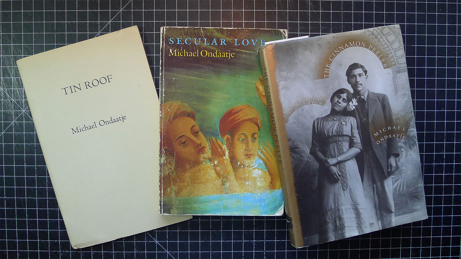
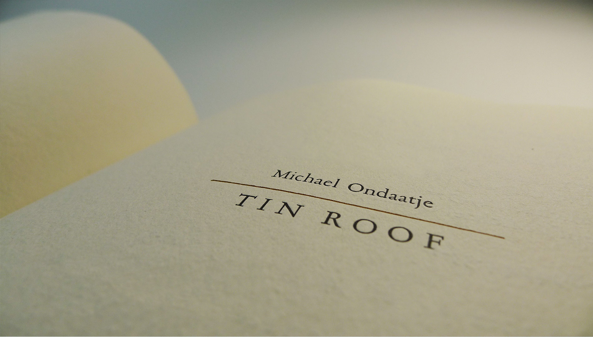
¶ Tin Roof first appeared as a small pamphlet produced in 1982 by the Island Writing Series (Lantzville, BC), now a rather scarce item. It then appeared as the third section of the poetic "novel" Secular Love (Coach House, 1986), eventually landing in Ondaatje's collection of selected poems The Cinnamon Peeler. After tracking him down through the kind folks at Coach House Books, Michael responded quickly to my query and was enthusiastic about the project, which then led to a somewhat lengthy dialogue with his various agents and publishers, before an agreement was finally hammered out late in 2011. From there began a rather epic adventure into the technical side of fine-press printing, which has made all other Greenboathouse Press projects seem like practice sessions for the real thing.
The Type: Jan van Krimpen's Romanée
¶ Also in 2011, I made a trip to Holland to conduct research on the Dutch typographer and type designer Jan van Krimpen. Part of that trip was to ship back to Canada a large amount of Van Krimpen's Romanée type, which has been unavailable since the 1960s, and even up to that date it was not an easy type to obtain.
¶ On returning home, and after resorting the type into cases, I discovered, to my horror, that the type consisted of two different heights (.928 & .933), and in the process of unpacking, those two heights had become mixed together.
¶ The problem is that when mixed and printed, the taller type (keep in mind that we're talking about only 5/1000ths of an inch), prints deeper and darker than the shorter, making a spotty and sloppy looking page. Thus, the only solution was to mill down the .933 type to .928, which sounds simple enough. The problem, though, is that we're talking about 5/1000ths of an inch to be removed, and the cut must be accurate to within 5/10,000ths of an inch, which is five times thinner than a human hair.
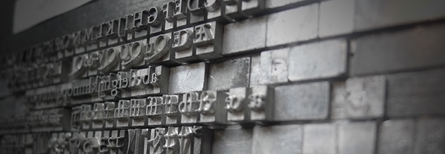
¶ This process required a number of stages. First, the entire 28 pages of the poem were set from the mixed cases, and a proof was taken with the press height set to exactly.933. Thus, the only sorts (characters) that printed were the taller ones. Those sorts were then plucked out of the forms to be milled down.
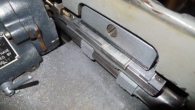
In the first image above you can see two columns of type in the holding tray. The column on the left is .933 type, and the column on the right is the type after milling it down to .928. In the next image is a closer shot of a dozen or so sorts in the type clamp, ready to be taken past the milling blades.
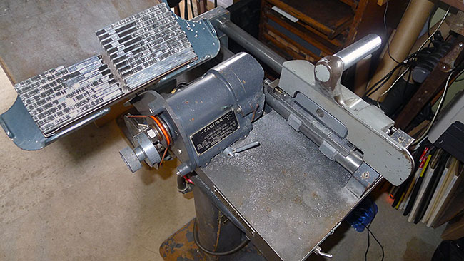
¶ The machine used for the milling is a Ludlow SuperSurfacer, modified to cut type rather than Ludlow slugs. A new type-holder had to be fabricated (based on a drawing kindly provided by Dan Jones in Toronto). I also made the addition of a tightening screw, which can be seen at the far end of the type holder in the image above. This screw can be wound in to apply pressure to the end of the line, keeping the sorts from being "pushed" by the blade. After many emails back and forth to Dan and also to Rich Hopkins, and more than 2 weeks of adjustments to the machine, I was finally getting results in the threshold of .0005", meaning that the type milled was ranging between .928" and .9285", a variance that did not reveal itself when printed.
¶ Only a handful of sorts could be milled at a time (around 20), and each batch had to be carefully set into the milling machine, the type pressed snug against the wall of the holder to get it flush to the blade, the feet of the type oiled for a clean cut, and the carriage was then run, slowly, past the milling blades. The type then had to be brushed clean of debris, and each sort inserted back into its proper place in the form. From time to time a few sorts would be cut too short (the result of not being pressed in against the holder firmly enough), and would have to be tossed and milled again, and thus the process was a slow and absolutely precise endeavour.
¶ Another bump in the road is the practical impossibility of obtaining any of the Romanée italic types. Those lucky enough to have this stuff aren't eager to let it go, and so while I have plenty of the roman, I was in a bind for the handful of italic words in Ondaatje’s poem. After a few trials, I decided on Monotype Van Dijck, a type that Van Krimpen helped design with Stanley Morison, and a revival of the original type with which Romanée roman was meant to pair. (Romanée roman was designed in 1928, but its companion italic was not designed until 1949). The Romanée used for the book is 14pt Didot (roughly the equivalent of 15pt here in North America), while the Van Dijck is our 14pt, meaning that the type body is shorter than the Romanée (for body height, think of distance from the top of a lowercase h to the bottom of a lowercase y). It is also American height (that is, the height of the actual piece of type: .918), meaning that the shorter Van Dijck had to be propped up in order to print at the same height as the .928 Romanée. Thus, each word in italic had to have paper shims placed beneath the type, and copper shims inserted above and below in the form so that it would align with the Romanée. [One might wonder why I didn't just mill all of the Romanée down to .918 and thus avoid this part of the problem. At the time it seemed less time-consuming to only mill the .933 type down to .928, and so this was the process undertaken for Tin Roof. However, the task is now (2019) well underway to mill all of it (over 800lbs) down to standard .918.]
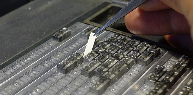
In the images above, first paper underlays are inserted underneath the Van Dijck type to raise it from .918 to .928. Copper spaces are then added above and below the 14pt italic to align the baseline with the foundry type, which is 14pt Didot (approximately 15pt).
¶ From there proofs were taken of each form, which were then scanned and sent off to Crispin Elsted at the Barbarian Press in Mission, BC, for proof-reading. Once back, I went through the proofs again looking for spacing issues and damaged sorts. Corrections were then fixed in the forms, micro-spacing issues were cleaned up, and fresh proofs were taken.
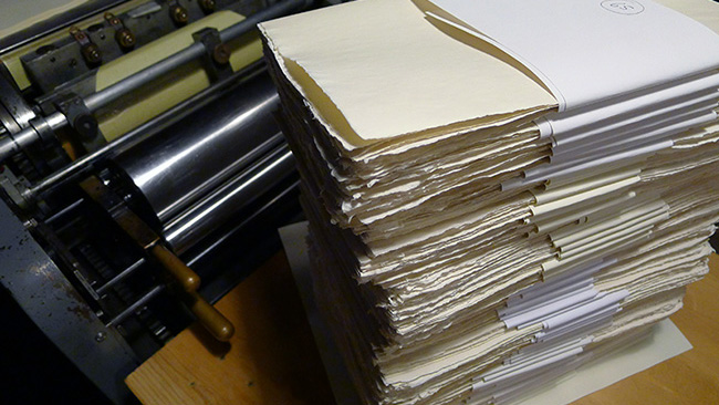
The Book Papers
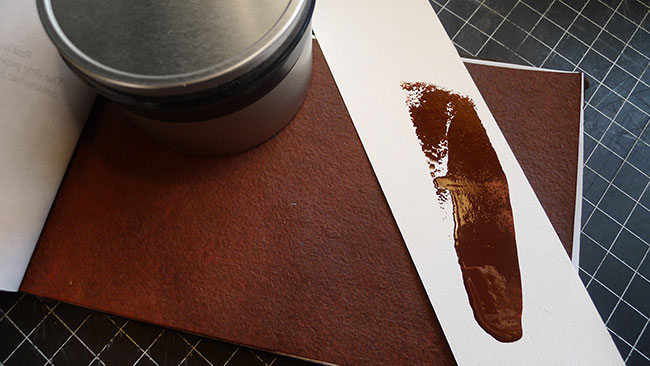
¶ The page paper for the book is a handmade cotton sheet made by Reg Lissel in Vancouver. 800 sheets were required for the edition, and after a number of test batches, Reg and I confirmed the weight and colour of the sheet, and he got to work for the next few months lifting and pressing. At the same time, I commissioned 75 sheets of a heavy handmade paper from Cave Paper in Minneapolis for the book's cover. This is a lovely, deep red-walnut / terracotta, and I've wanted to do something with it for years. The second colour ink for the book has been mixed to match this paper, both of which can be seen in the image below. Plenty of the ink was mixed, as the press will have to be inked up 6 or 7 times during production.
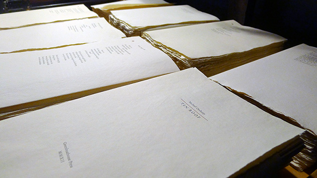
Printing Completed
¶ Once printing was completed, the colophons were sent off to Ondaatje to be signed, and on their return the pages were folded and collated into book bundles to be sent off to the binder. The binding design has the book block (the gathered pages) sewn and glued up at the spine, then bound into a limp wrapper, the title printed in black on the front. The book is then housed in a slipcase covered in black Japanese silk, the binding executed by Vancouver-based Alanna Simenson, who also bound the Greenboathouse Géricault & Morison and Lead, Tin & Antimony.
¶ And so, at last, the project was wrapped up. Everything was rushed off to the binder to get copies ready in time for the CODEX International Book Fair in Berkeley, California in February, where the book was launched. By chance Michael Ondaatje happened to be in San Fransisco at the time of the fair and it was a pleasure to have him stop by our table for a few hours.
¶ To see images of the completed project, head back here and have a look at the slideshow.
January, 2012