Arranging Furniture
Jason Dewinetz, with an introductory essay by Aaron Peck.
For images of the production in process, please visit our Instagram page.
¶ After completing production on Alan Loney’s 49 Days in 2018, I found myself all the more fixated on Agnes Martin. Her grid drawings heavily influenced my approach to the title page of 49 Days, and with that book done I was all the more inclined to explore her work further.
¶ At first my idea was to reproduce some of her grid drawings using brass printer’s rule, and while this provided the technical challenge I was looking for, the printed results lacked the delicacy and human fallibility of her hand-drawn compositions. Turning to her colour field paintings, it struck me that the proportions of her bands of colour were very similar to letterpress furniture.
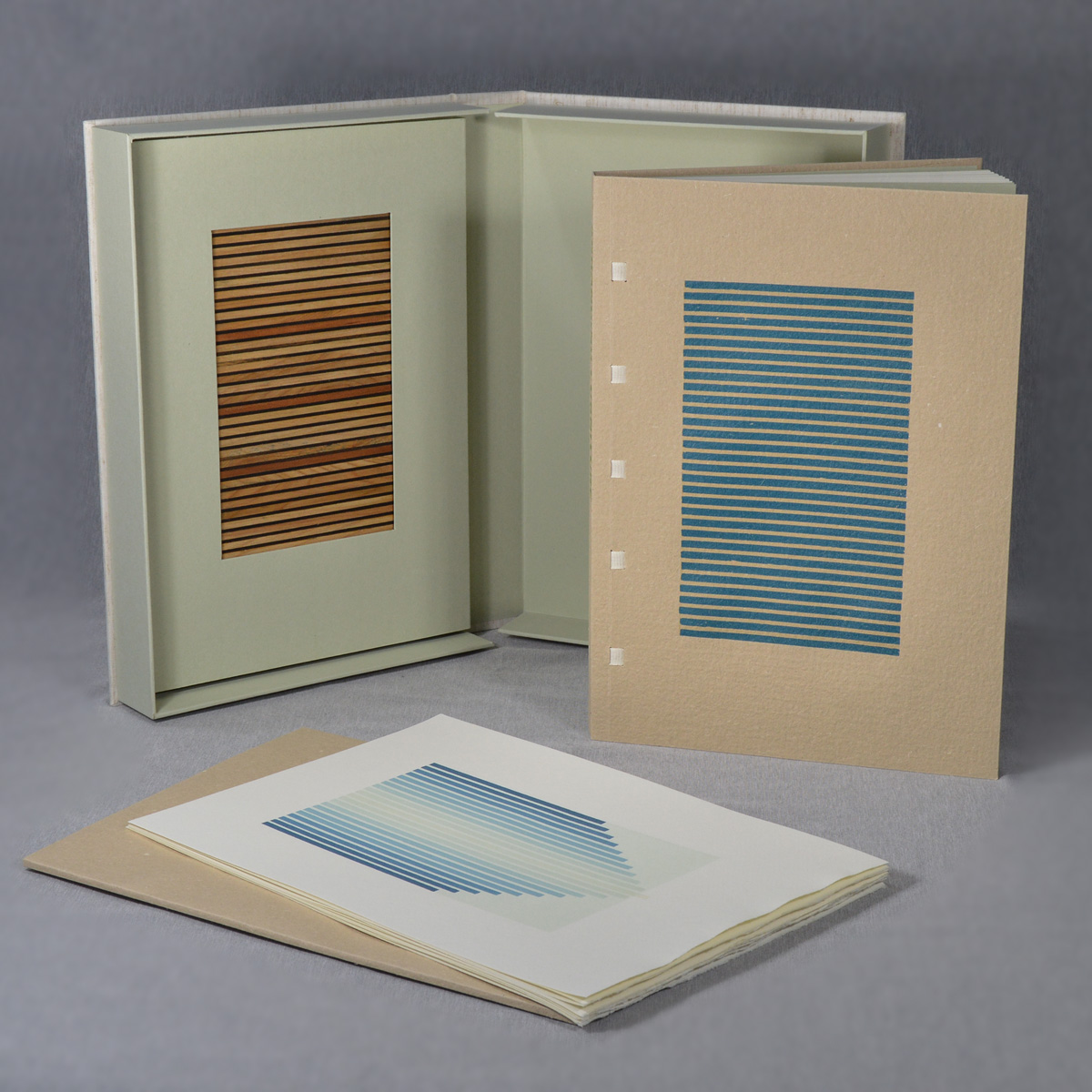
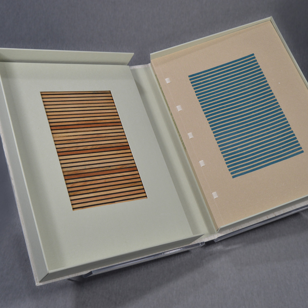
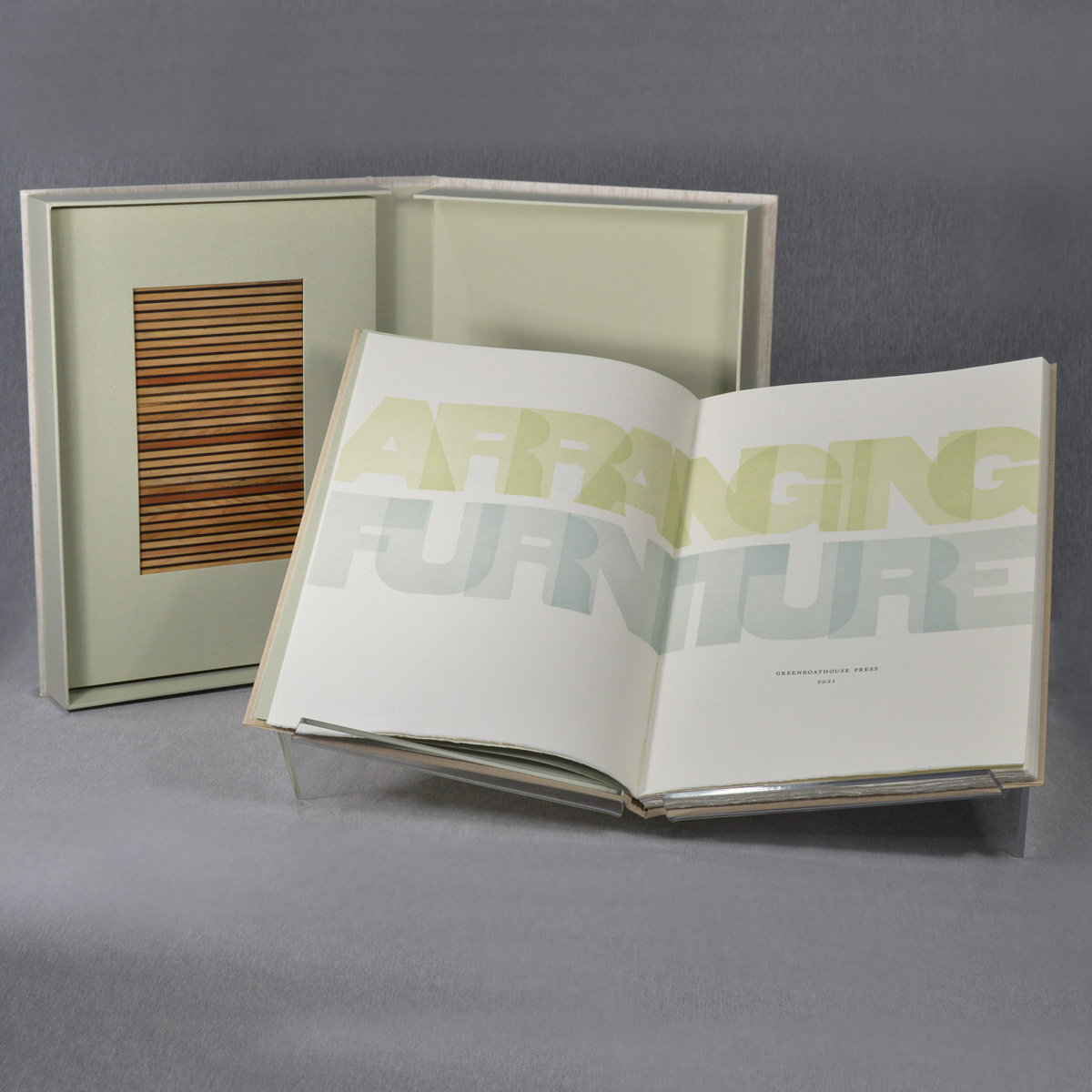
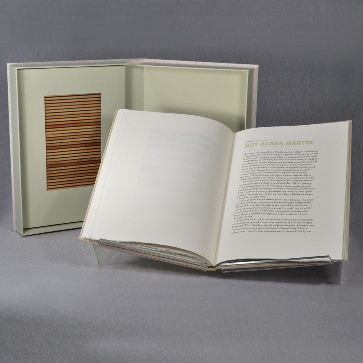
One of 10 Deluxe copies of Arranging Furniture, including a portfolio of prints and one of the forms of wooden furniture embedded in the upper tray of the drop-spine box.
¶ I then concluded to produce a book recreating some of Martin’s paintings, using only furniture to reproduce her compositions. I bought up every monograph I could find and scoured the internet, and eventually settled on 26 paintings that would present a variety of challenges to produce on the press. A mock-up of the book was put together and a proposal sent off to the Agnes Martin foundation. And that was the end of that idea.
¶ Still, my good friend Aaron Peck, a writer and art critic for various magazines including Artforum and frieze, encouraged me to break away from the reproduction approach and simply run with the idea of working with furniture, and as so often happens, a disappointing slammed door turned into an opportunity to experiment. Setting the reproductions aside, if not Agnes, then no square. And if no square, then, given the codex, obviously a rectangle. And if a rectangle, then of course the Golden Section.

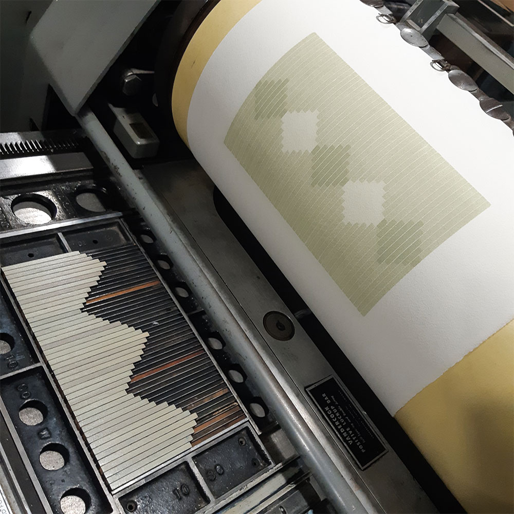

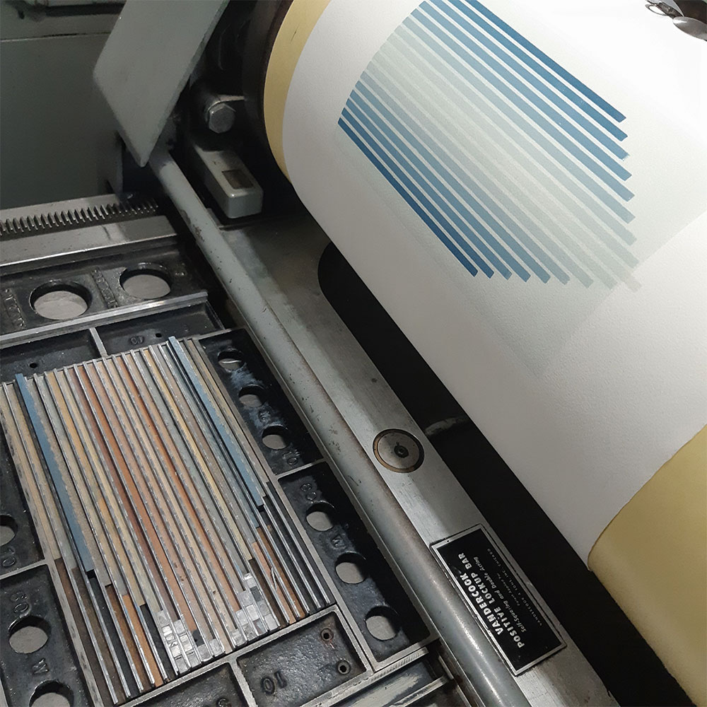
¶ With the idea beginning to firm up, it was time to get to work. Both digitally and physically furniture and reglet were positioned and positioned again, switched-out and recombined, set up and torn down, then sanded smooth and propped up to type-height, again and again and again. And what was it that I was actually doing, besides making a mess? Moving stuff around, and then moving it around again. Putting things in a neat, attractive and, given the restraints of letterpress printing, required order. Arranging furniture.
 Aaron Peck is a contributing editor at frieze magazine. His books
include The Bewilderments of Bernard Willis and Jeff Wall: North & West. His work has recently appeared or is forthcoming in Walrus, the New
York Review Daily, The Believer, and the Los Angles Review of Books. He
lives in Paris, France.
 Jason Dewinetz is a writer, editor, publisher and typographer originally from, and now living back in, the Okanagan Valley. With an academic background in English Literature (BA. UVic, MA, U of Alberta), he is the author of The Gift of a Good Knife (Outlaw Editions), Moving to the Clear (NeWest Press), Clench (Gaspereau Press), Friends & Family and If the Winds Come, and co-author of A Bibliography of the Black Sparrow Press (University of Alberta Press). He is the founding editor, publisher and designer of Greenboathouse Press, and his design and production for Greenboathouse has brought in more than a dozen national book design awards. Jason is a current board member and past-North American Chair of the Fine Press Book Association, and is an instructor in the Writing and Publishing program at Okanagan College.
2021
9.25" × 12.75", 72pp. 70 copies.
Printed on 150gsm Hahnemühle Biblio. The book is comprised of 24 compositions accompanied by an introductory essay by Aaron Peck discussing the prints in a context of Canadian landscape painting and, in particular, the colour palette of the Okanagan Valley. The text is hand-set in 16pt Cloister Lightface, cast in-house from the original ATF matrices, with some beaten up old Franklin Gothic for headings, and some equally beat up wood type for the title page.
The book is bound in a stiff paper case of St Armand Sisal Coffee with exposed linen thongs, with one of the furniture compositions printed on the front. The end-sheets are Barcham Green Charter Oak, with the book held in full-cloth slipcase. 60 copies.
The deluxe issue includes the book as described above, along with a portfolio containing a selection of 10 prints from the book. Both items are enclosed in a full cloth drop-spine box, with a recessed paper label on the spine, and one of the forms of wooden furniture used to print the compositions mounted inside the upper tray. Ten deluxe copies (A-J) have been produced, all of which were reserved prior to publication.
Standard Edition: $750
ISBN: 978-1-894744-42-3
Out of Print
Deluxe Edition: $1500
ISBN: 978-1-894744-43-0
Out of Print

Alcuin Society Book Design Award Winner
Colophon:
The type is 16pt Cloister Lightface, cast in house from the original ATF matrices on a Monotype Super Caster, along with some 18-line wood type and beat-up Franklin Gothic for the title page and headings. The paper is Hahnemuhle Biblio with Barcham Green Charter Oak for the end-sheets. The edition is comprised of 60 standard copies (1-60), and ten deluxe (A-J), all bound by Alanna Simenson in Sooke, BC. Printed on a Vandercook 15-21 and 219 over the course of a very unsettled 2020 in the finally-finished new shop in Vernon, BC.